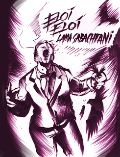
This would still technically constitute as a fanart, but not totally. It's another artwork I did based off of C.S. Lewis' Space Trilogy, this time the disturbing satan allegory Un-man from Perelandra.
"So you mean to try strength," it said in English, speaking thick.
"Put down that bird," said Ransom
"But this is very foolish," said the Un-man. "Do you not know who I am?"
"I know what you are," said Ransom. "Which of them doesn't matter."
"And you think, little one," it answered, "that you can fight with me? You think He will help you, perhaps? Many thought that. I've known Him longer than you, little one. They all think He's going to help them - till they come to their senses screaming recantations too late in the middle of the fire, mouldering in concentrations camps, writhing under saws, jibbering in mad-houses, or nailed on crosses. Could He help Himself?" - and the creature suddenly threw back its head and cried in a voice so loud that it seemed the golden sky-roof must break, "Eloi, Eloi, lama sabachthani." And the moment it had done so, Ransom felt certain that the sounds it had made were perfect Aramaic of the First Century. The Un-man was not quoting; it was remembering.
The Un-Man's quote, for those of you who don't know, were some of Christ's last words before his death on the cross, translated to "Father, Father, why have you forsaken me?"
Okay, now for some insider secrets, ha. I prefer to work tradigitally, usally meaning a traditional linework or underdrawing, with digital coloring layed on. For those wanting to work in a style like this, here's a quick tutorial on how this particular image was created.
First step: Drawing. This drawing was done with black copic marker and other assorted inking pens. Scan this drawing in at least 300 dpi.
2nd step- Remove the black. One thing many artists forget to remember is the deadening power of black. The color black can makes things appear very heavy, without subtlety, and most importantly, can suck the life out of any colors you put over it. Black and white are a good combo, but when color is involved, try to stray away from pure black.
Here, I used Hue/saturation on colorize to make the linework a purpleish color. Purple goes well with just about anything.
3rd step- More color harmony in lines. For this particular piece, I wanted all of the rich colors of the background to seep into the color of the lines as well. I did this by creating an adjustment layer over the linework set to screen. This means that only the lines are affected by this screen layer, none of the others.
4th step- Background colors. Add various layers of varying hues, opacities, and brush styles to create a cloudy, colorful background. Nothing too garish or saturated.
5th step- Lastly, color in the subject and once again play with opacity. Letting some of the background colors show through doesn't hurt any.
And that's it for me today. Blogger's giving me problems, and my modem's being a total dingus. Good night.
Space Trilogy © C.S. Lewis or current copyright holder.
Artwork © Neal Anderson


I just would like to point out how amazing this is. Thanks!
ReplyDelete